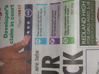
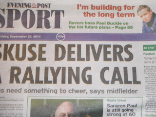
This is a cover of the new-look Evening Post and is an example of the influences that I have had for my local newspaper. The brand alike my 'Element' brand as a degree of unity and I like the space that is created from making the masthead more compact however arguably even more striking.
I like the space to the right of the masthead which is used almost as an extra headline to invite the reader to seeing a special feature or something of interest for the reader. I have transformed this area of space on my newspaper to advertise the Sport round-up pull-out inside. There is also space to place an image like I have done with my Bristol City player to overlap the banner from my masthead.
A main feature of the new Evening Post is that the main image is split over two pages which allows the newspaper to instantly get a more sleek look. The images are significantly bigger than a standard newspaper and I like the idea of using clear and quality photos to sit alongside my photo.
I like the articles having something of a sub-heading in a different colour above the main headline whilst the circular image again adds an extra dimension to the paper. It gives the reader more flexibility to scan the page as it appears more compact and allows the reader to dismiss or read a story.
I like the large images and the way the caption overlaps the corners of the images which again makes it quirky and intriguing visually whilst maintaining the regular conventions of a local newspaper.
The double-page spread again here summarises all of the new features in action as it were. Big images and splashes of colour contrast the regular and 'old' Evening Post lay-out.
The interior of newspaper has been revolutionised and the 24hr focus as well as a 'Focus' and 'Sport'. My paper fictionally doesn't have the same ideas however the use of colours and house style is similar.
The advertising here is new and modern. It takes up less space allowing the masthead and stories to take centre stage, which is how I want my newspaper to work too.
Back page: Sport has changed significantly too. Whilst on work experience with the Bristol Evening Post, I was informed of a change in layout of Sport, to freshen it up. But it has changed hugely as can be seen below. The whole paper has had to change in order for the reader to navigate easier around pages. Especially with the online developments the print industry is more competitive than ever.


No comments:
Post a Comment