
Here you can see where I experimented on InDesign advertising the features inside my newspaper on the right hand side. The 'S' represents different topics and the different colours would be representative of certain features. This idea works well on the Bristol Evening Post however I believe that my audience haven't ever demanded or suggested that they would need such features inside my newspaper.

The above photo is my initial cropped image which I took off of my phone which means it is poor quality and therefore I need to take my own photos via a digital camera of this image. I want this style and angle of the image to work as my logo and I can see it has potential although the original image needs to be better and higher quality to appear on my professional publication.
I used PhotoShop to crop my image and this is evident above although a lot of cropping is very rough and edgy. Again this cropping isn't professional enough to be part of my final paper however it does give me a great impression of what my logo and paper could look like with a similar photo.
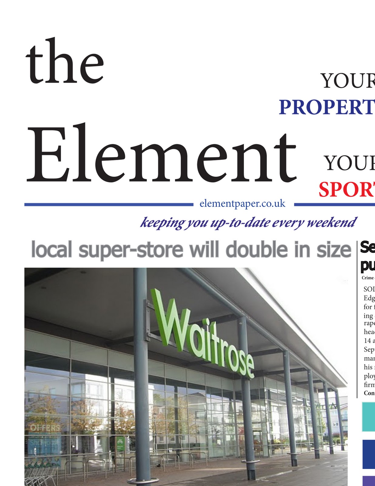
The cover above was when I had the slogan below the masthead which I liked as it fitted in nicely below the website however it left valuable space to each side of it. I also experimented with moving the 'YOUR SPORT' and 'YOUR PROPERTY' around the page as originally I had the headings/advertising alongside bigger images. The words don't really fit comfortably alongside the masthead although I like the idea of the use of the personal pronoun of 'your' and it could work nicely on my newspaper's poster.

Above, I played around with the masthead and how it could possibly appear. I moved around the definite article whilst the block colour above also makes the masthead and image feel a bit caged in.
No comments:
Post a Comment