Friday 30 September 2011

Logo Photos - ready for editing and cropping


This photo alike all of the below were taken to form the base of my logo for my newspaper. I aim to crop around the outside of the angel and instead use almost a silhouette of the image as part of my striking logo. Here, I like the way in which the arms spread out and convey an open and welcoming image to the reader.


This photo is similar to the one above and is possibly closer to my finished article, in terms of my logo as you cannot see so much detail on the material and shape of the angel itself. However this photo also highlights some grey areas in terms of minute gaps of the body which would have to be filled in order to be part of my logo.

Different angle, same image. Striking pose makes it viable for Element logo

Long shot, the shape retains class and stature, which I want my paper and brand to suggest

I zoomed in heavily on this photo and this couldn't really help me in my publication unless it appeared at the bottom or top of the page near page numbers or something similar. A possibility to use, but only as influence as a logo.

Unity, is what this image portrays to me and I actually like the detail and colour here. The extended arms are something that could be used to fade the image and retain focus on the body should it be kept as a logo.

A really engaging shot that I can play with to see if it could work as a logo or if not in some capacity as my brand. On my poster it's a possibility if using Photoshop I could edit it to perhaps grayscale the figures but perhaps give one a splash of colour in-keeping with my house style and modern appearance.

Bad photo, further influence for logo though

You can see the diversity this image portrays alone and this sort of zoom really allows the angel to dominate which it may or not do as part of the Element brand. Not every newspaper logo is known as a logo? Ie examples such as the Sun which are more about the brand.

Same style shot, unity and individuality together as one

Wonky shot, not viable for logo, although perhaps could match quirky Element style.

Broad and dominant, would work acutely as a logo

After cropping this could work wonders. Perhaps with two different coloured angels holding hands as they are could bring the Element as a paper and a brand to life. Real substance


I took all of these photos of public art in Portishead in order to ensure I had the right shots to be able to have my logo for my local newspaper, 'the Element'. The images will have to be cropped in order to stand alone as the current pixelated image does on my front cover. I have thought about multiple layers of the same image or similar angles to create a really striking image for perhaps my cover or even just to impact on my poster. 

Images such as the one directly above could also be used to reflect unity whilst symbolising the local area as a logo and as part of my brand.
Photo - logo - art angel
theguardian - definite article
new BEP layout - why
feedback from teacher
colour scheme
comparing old with new
photoshop - images
story-writing
narrative
human photos
Guillaume picture.

Since the very start of creating my newspaper, the use of 'the' as a definite article is an interesting one in terms of how I use it as a masthead. Do I ignore it and just call my paper the Portishead or something element, using a place name as a replacement for the definite article. But I have instead decided to retain it, and keep hold of the 'the' by underlining it and using it to not only dominate my masthead but to build up my brand just as the guardian newspaper did by making their brand all lower-case.

I could have easily used standard grammar for The Element but instead I have remained happy with the lower case 'the' whilst making 'Element' stand out in a bigger pt font too.

Thursday 29 September 2011

Bristol Evening Post


This is a cover of the new-look Evening Post and is an example of the influences that I have had for my local newspaper. The brand alike my 'Element' brand as a degree of unity and I like the space that is created from making the masthead more compact however arguably even more striking. 

I like the space to the right of the masthead which is used almost as an extra headline to invite the reader to seeing a special feature or something of interest for the reader. I have transformed this area of space on my newspaper to advertise the Sport round-up pull-out inside. There is also space to place an image like I have done with my Bristol City player to overlap the banner from my masthead.  

A main feature of the new Evening Post is that the main image is split over two pages which allows the newspaper to instantly get a more sleek look. The images are significantly bigger than a standard newspaper and I like the idea of using clear and quality photos to sit alongside my photo. 

I like the articles having something of a sub-heading in a different colour above the main headline whilst the circular image again adds an extra dimension to the paper. It gives the reader more flexibility to scan the page as it appears more compact and allows the reader to dismiss or read a story. 

I like the large images and the way the caption overlaps the corners of the images which again makes it quirky and intriguing visually whilst maintaining the regular conventions of a local newspaper.

The double-page spread again here summarises all of the new features in action as it were. Big images and splashes of colour contrast the regular and 'old' Evening Post lay-out. 

The interior of newspaper has been revolutionised and the 24hr focus as well as a 'Focus' and 'Sport'. My paper fictionally doesn't have the same ideas however the use of colours and house style is similar. 

]
The advertising here is new and modern. It takes up less space allowing the masthead and stories to take centre stage, which is how I want my newspaper to work too.

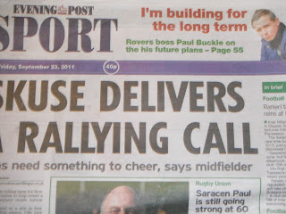
Back page: Sport has changed significantly too. Whilst on work experience with the Bristol Evening Post, I was informed of a change in layout of Sport, to freshen it up. But it has changed hugely as can be seen below. The whole paper has had to change in order for the reader to navigate easier around pages. Especially with the online developments the print industry is more competitive than ever. 


Wednesday 28 September 2011

Ongoing design

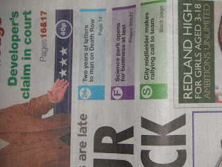
Here you can see where I experimented on InDesign advertising the features inside my newspaper on the right hand side. The 'S' represents different topics and the different colours would be representative of certain features. This idea works well on the Bristol Evening Post however I believe that my audience haven't ever demanded or suggested that they would need such features inside my newspaper.


The above photo is my initial cropped image which I took off of my phone which means it is poor quality and therefore I need to take my own photos via a digital camera of this image. I want this style and angle of the image to work as my logo and I can see it has potential although the original image needs to be better and higher quality to appear on my professional publication. 
I used PhotoShop to crop my image and this is evident above although a lot of cropping is very rough and edgy. Again this cropping isn't professional enough to be part of my final paper however it does give me a great impression of what my logo and paper could look like with a similar photo. 


The cover above was when I had the slogan below the masthead which I liked as it fitted in nicely below the website however it left valuable space to each side of it. I also experimented with moving the 'YOUR SPORT' and 'YOUR PROPERTY' around the page as originally I had the headings/advertising alongside bigger images. The words don't really fit comfortably alongside the masthead although I like the idea of the use of the personal pronoun of 'your' and it could work nicely on my newspaper's poster.

Above, I played around with the masthead and how it could possibly appear. I moved around the definite article whilst the block colour above also makes the masthead and image feel a bit caged in. 


Tuesday 20 September 2011

Latest advances


I have now begun to use Photoshop to edit my images for my ears. The ears have the aspects of my newspaper and works as an advert for my own paper. The images were both original images of mine and were edited so that there is adequate white space behind them. I also have left a smart gap for the masthead to still dominate the cover. I will now look at changing the colour of my conventional paper and will experiment with my logo and the size.


Beginning adverts and logo

I am now at the stage where I must experiment to create a logo for the Element as well as making my adverts, something that I can do by using images I have already taken with my camera.

Monday 19 September 2011

Cover and Inside page with my own photos

FRONT PAGE of 'the Element'
My front cover has seen many changes since the intial design which was drafted roughly. Now the front cover is taking shape with my own photo as the cover image, you can see how the Element will look when finally printed out and finished. Evidently the paper needs to still incorporate the advertising space which is vacant at the moment and thast is the enxt step for my newspaper, I will start to create advetrts whilst using the photos I have have already taken, whilst taking new ones.
I will experiment with a wealth of photos to see whether the photo fits with the page and to ensure that the page doesnt read from left to right and instead that the reader can read as they wish. Dismissing stories that disinterest them ,however it is important to remember my audience research which is intergal to my paper. I must remember that my audience want factual stories with a few images sprayed around the paper with a hint of colour.
The image from the sex offender story isn't original and that needs to be changed fairly soon to ensure I can edit and finalise every last detail of my cover as I wish.


INSIDE PAGE of 'the Element'


 The above inside page has seen rapid development, from the writing of the stories through to the photos now being displayed on the page. The images are mostly my own however the bottom left photo still needs to be altered. The headlines appear realistic and similar font to the sub-headlines from my main case study, the Bristol Evening Post.

I need to write my stories for the rest of the inside page and will finalise these at a later stage to ensure they are written in the narrative structure. I need to structure the page and divide them up so that they don't read as one. I may also again experiement with different stories and images on the page.

Sunday 18 September 2011

Photos for ads and stories


I took the above photo located at the Portishead Marina where I thought the houses could work as a photo after editing for an advert however the view is from a distance and would be perhaps more appropriate to go along the top of the paper of behind my masthead as a watermark.


This image I took thinking that after editing it could work brilliantly to advertise housing adverts inside my paper as part of the ears. The building is in Portishead and I believe the shape and sheer impressive building itself would fit my chic target audience and paper itself.


This photo was taken with adverts in mind, for housing or to let/rent houses however I needed to make sure I didn't just take photos of peoples house's without permission therefore I took this more vague shot. I probably won't go on to use this photo however I could still consider it. 


Waitrose, dominate my cover page, as a supermarket and somewhere I work it was an easy story to create, a true one, and this photo is a simple snapshot of the store and supermarket which I can use for my inside pages.


This photo (above) is likely to be used as my main cover photo as the large photo creates everything I wanted from a cover photo. The logo of Waitrose links with the headline, 'green light' and the I like the camera angles. The mise-en-scene appears dark and the store appears as if it is ready to undergo development, alike the story.


This is another photo which I took with the front page in mind as the brand is clearly there and the picture alike the one above is quite imposing on the reader.


This photo is a one I took fresh off a building site, thinking that it could come in handy should I write a story on something such as building or expansion. It could even link to the Waitrose story although the size of the building would perhaps rule that out.


These apartments appear a figurehead of Portishead housing and they could spearhead my advert for housing on the ears. This a reverse shot of the second photo on this post. 


Waitrose car park: Could be used as a potential inside page shot


I zoomed in on the Waitrose store as well as the car park which appears homely and the trees act as a guard somewhat of the logo. The cars show some activity whilst it was a rainy day the photo still manages to reflect where the supermarket is and what it looks like. 


This photo is a picture of a closed pub, which I can use to link to the story on my inside page of pubs closing down. I picked the White Lion as it looks classic and certain aspects including the logo of it make it appear ornate and imposing. Below I also stood further back to snapshot the photo as it shows the Pub clearly closed down, which is all I need my photos to show, the story.