 |
| 'portishead peoples' much brighter and heavy cover page |
 |
| contrasting layout to the post |
 |
| the use of feedback/comments; nice image, use of colour and the clear convergence onto the webpage. Also the adverts on the page are to heavier ratio here than in the evening post. |
 |
| 3 images! Picture heavy, headshot effective 'i' style topics at the top of the page, nice splash of colour |
 |
| interaction, comment, simple but effective technique, colour use |
 |
| zoom on portisheadpeople style, if it is theirs? |
 |
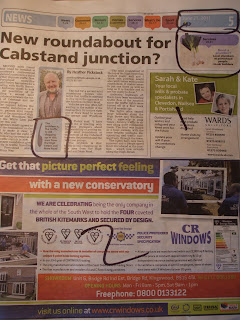
| inside page, busy, reliant on advertising |
 |
| 2 large adverts, advert ratio here much higher |

No comments:
Post a Comment